App Properties
Every NIM app can be customized through its properties. This includes the app's title, layout, color scheme, and more. This article will show you were to access these properties, and explain what they are.
To edit an app's properties, first follow these steps:
Navigate to Configuration > Apps.
Locate that app you wish to customize and click its
 edit button.
Click on the Props tab.
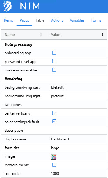
You should see the following set of properties.
Note
If you see a different set of properties, you probably have a different form item selected. Click on the app's top header bar to select the app itself and expose its properties.
Each property changes how the app behaves or looks. The Data processing properties affect which variables are present in the app and how it talks to the NIM service.
Onboarding app: Marks this app for use during user onboarding. Several variables and form roles are added to the app.
Password reset app: Marks this app for use during password reset. Several variables and form role sare added to the app.
Use service variables: Enabling this adds several variables to the app, such as the current session's user, and variables defined in the Variables configuration section.
The Rendering properties affect the look of the app and how it is displayed on the dashboard.
Background-img dark: The background image displayed when a user has the dark theme enabled.
Background-img light: The background image displayed when a user has the light theme enabled.
Categories: A comma-separate list of categories to be assigned to this app. These categories are shown on a dashboard by the
dashboard navigationform item.Center vertically: If selected, the app's main content area is veritically centered within the browser window.
Color settings default: If selected, the default NIM color scheme is applied. If unselected, the following properties are exposed:
Color bg dark: The background color to apply when a user has the dark theme enabled.
Color bg dark opacity: A value from 0 to 1 (e.g., 0.5 is 50%) that controls the opacity of the background for the dark theme.
Color bg light: The background color to apply when a user has the light theme enabled.
Color bg light opacity: A value from 0 to 1 (e.g., 0.5 is 50%) that controls the opacity of the background for the light theme.
Description: A description of the application that is displayed as a tooltip on the dashboard.
Display name: The name of the application that will display on the dashboard.
Form size: Controls the width of the main content area.
Image: The image or icon shown on the dashboard for this app.
Note
The dialog has two tabs: Images and Icons.
Images are SVG or PNG files included with NIM or uploaded by you. Their use on dashboards is discouraged, as they will be deprecated.
Icons use the Font Awesome duotone set and are the recommended option for representing apps on the dashboard.
Modern theme: Toggles various theme settings for the app, such as font, heading size, etc.
Sort order: Controls how the app is sorted on the dashboard. Apps with a lower value are listed first. Apps with the same value are listed alphabetically.