Form Items
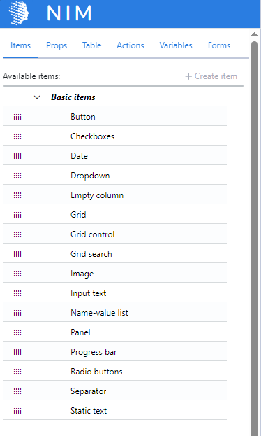
NIM apps are web forms that are comprised of one or more form items. These form items allow NIM to accept input from an end user, as well as display information to the end user. While designing a form, items may be dragged from the sidebar onto the design surface to build the form. Multiple form items can be bundled together into reusable blocks using the Compose Items feature.
This article details which form items are available to you.

Button
Buttons are most often used to launch actions within a form, such as submitting data, launching actions within a target system, or moving backwards and forwards through multiple forms.
Checkboxes
Checkboxes allow end users to select multiple options from a given list. The items may be entered manually through the item's Value property, or provided by a filter through the item's Table property. The selected items are stored in a variable as a comma-separated list of strings.
Dashboard Search
Displays a search box that allows users to search for an app by its display name. Selecting an item from the search results launches the associated app.
Date
Date fields present end users with a calendar, from which they can select a specific date. The selected date is stored in a variable in YYYY-MM-dd format.
Dropdown
Dropdowns allow end users to select one option from a given list. The items may be entered manually through the item's Value property, or provided by a filter through the item's Table property. The selected item is stored in a variable as a string.
Empty Column
An empty column fills up empty space within the form's column layout. These are useful if you want a form item to be displayed in the third column of a row, but have nothing but whitespace in the first two columns. This form item accepts no input and provides no output.
Grid
Grids display table data from one or more filters. The columns of the table are configurable through the grid's properties. End users may select a row of data, the cells of which can be stored in variables for use elsewhere in the app.
Grid Control
A grid control item helps end users navigate between different grid views. It provides a breadcrumb-like navigation using the display name of the grid views that users can interact with to go back to one view or another.
Grid Search
A grid search item provides end users with a search box that filters items within a grid. Unlike the grid's built-in search box, the grid search item can be placed anywhere on a form.
Icon
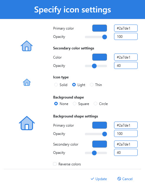
Displays an icon from the Fontawesome Duotone collection. The colors, size, opacity, and other properties of the icon may be customized.

Image
An image item displays an image from the file system. Available images are stored in C:\ProgramData\Tools4ever\NIM\config\images. Administrators may add additional images to that directly to make them available in NIM apps.
Input Text
Input text items allow end users to provide information to the NIM app. The values placed into the input text items are stored in variables for later use by the app, such as mapping onto a target system attribute when the app's form is submitted.
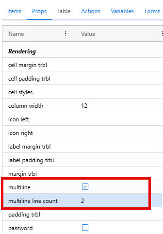
By default, an input text item is single line. It can be changed to multiline text box by enabling its multiline property. The height of the text box can be adjusted by altering the multiline line count property (default 2).

Name-Value List
The name-value list items displays a table of name-value pairs. These pairs can be configured through the Items property of the name-value list. Values can be either static text, or they can be javascript that is evaluated when the form is initialized.
Panel
The panel item displays a dashboard of all applications to which the end user has access. It only does this if its Apps property is enable.
Progress Bar
The progress bar item can display a visual cue to the end user of how far they are through a process. The value displayed on the bar is configurable through its Value and Value Maximum properties. These properties evaluate javascript upon form initialization to display the progress bar. For example, if Value is set to "50" and Value Maximum is set to "100", the progress bar will be half-way full.
Radio Buttons
Radio buttons allow end users to select one option from a given list. Unlike dropdowns, however, each item is displayed on the page. The selected option is stored in a variable for later user by the app.
Separator
A separate inserts a horizontal rule into the form. This gives a visual indicator that that two parts of the form are separate. This form item accepts no input and provides no output.
Static Text
The static text item allows app developers to display text within the app's form. The text can be formatted as a paragraph or a heading. Despite its name, the static text item can dynamically display text by evaluating javascript upon form initialization through its Text (Evaluation) property.
Hyperlinks
Hyperlinks are supported inside the static text item through markdown syntax. To create a link titled "NIM Documentation" that links to this website, you would type the following: [NIM Documentation](https://docs.nimsuite.com)
Each link in the a static text item creates a navigate to URL form action, shown under that item's Action tab. Those actions can be customized to change the URL destination, or whether the link opens in a new tab or the current one.