Step 4: Explore the Bootstrap grid system (tutorial)
In this step, we'll manipulate the grid system to lay out items within a form.
Form layouts are based on the Bootstrap grid system. Every form comprises rows, each of which can contain up to 12 columns. Each item spans one or more columns within a single row (the column width property).
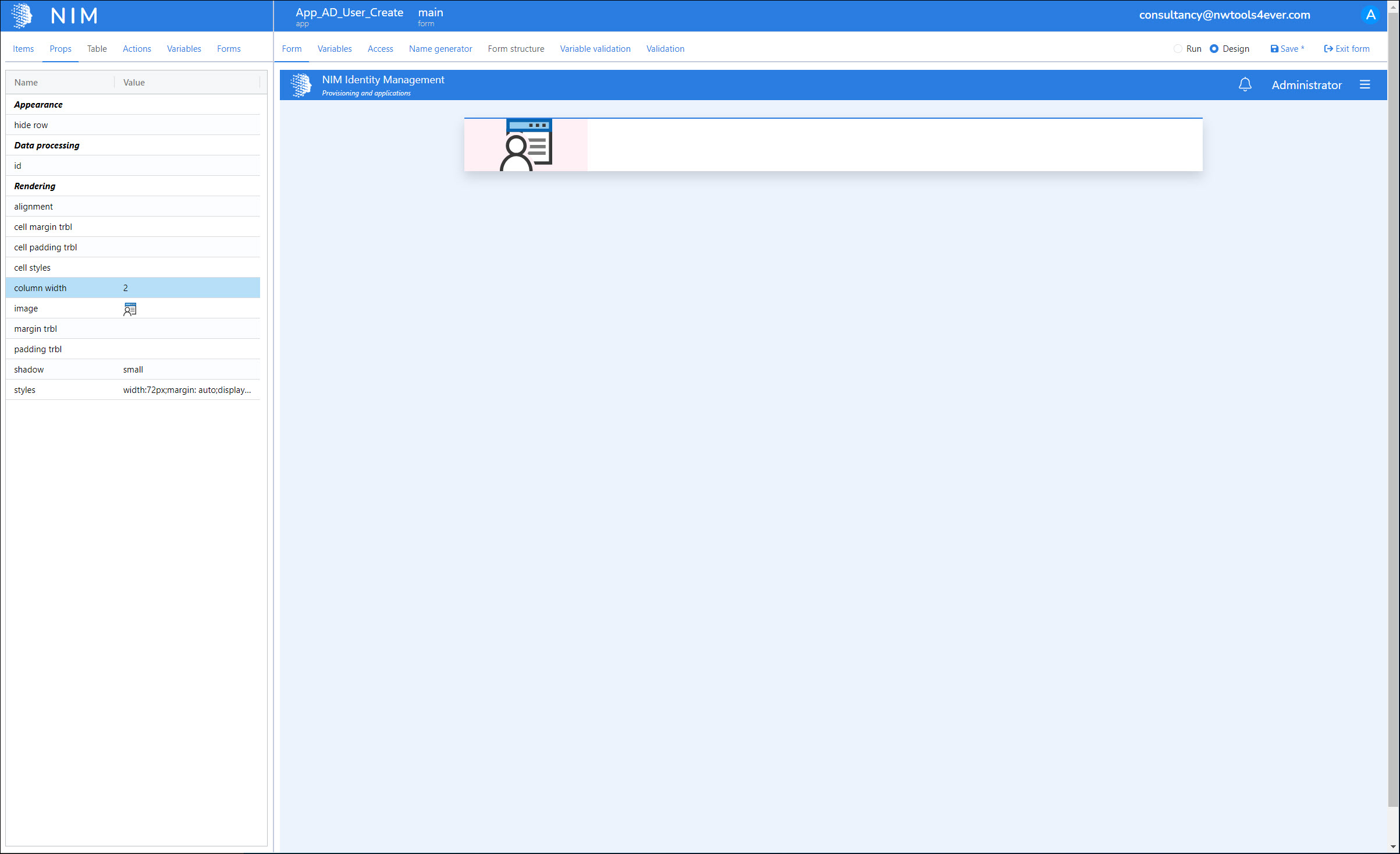
We need to make room for two additional items on this row. We'll click the column width property of the image, and change its value from
12to2.
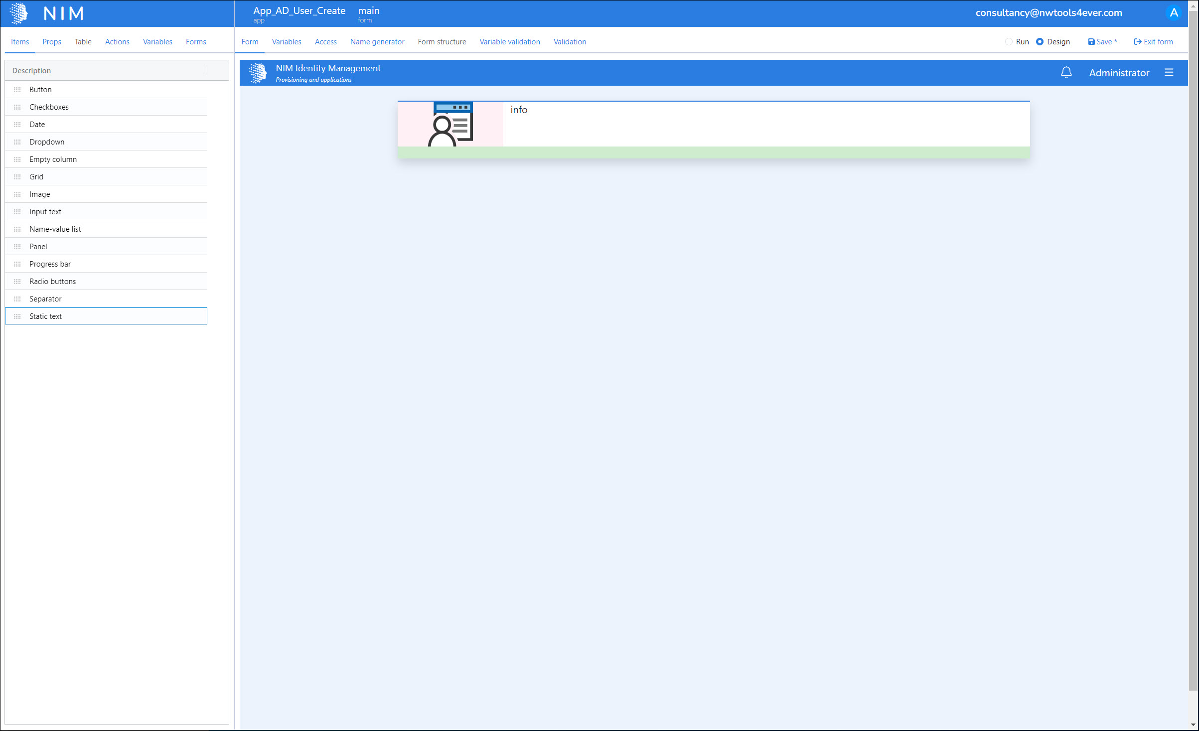
There are now 10 columns left in this row. We'll go back to the Items tab, and drag a Static Text item into the green drop zone to the right of our image, which represents these columns.

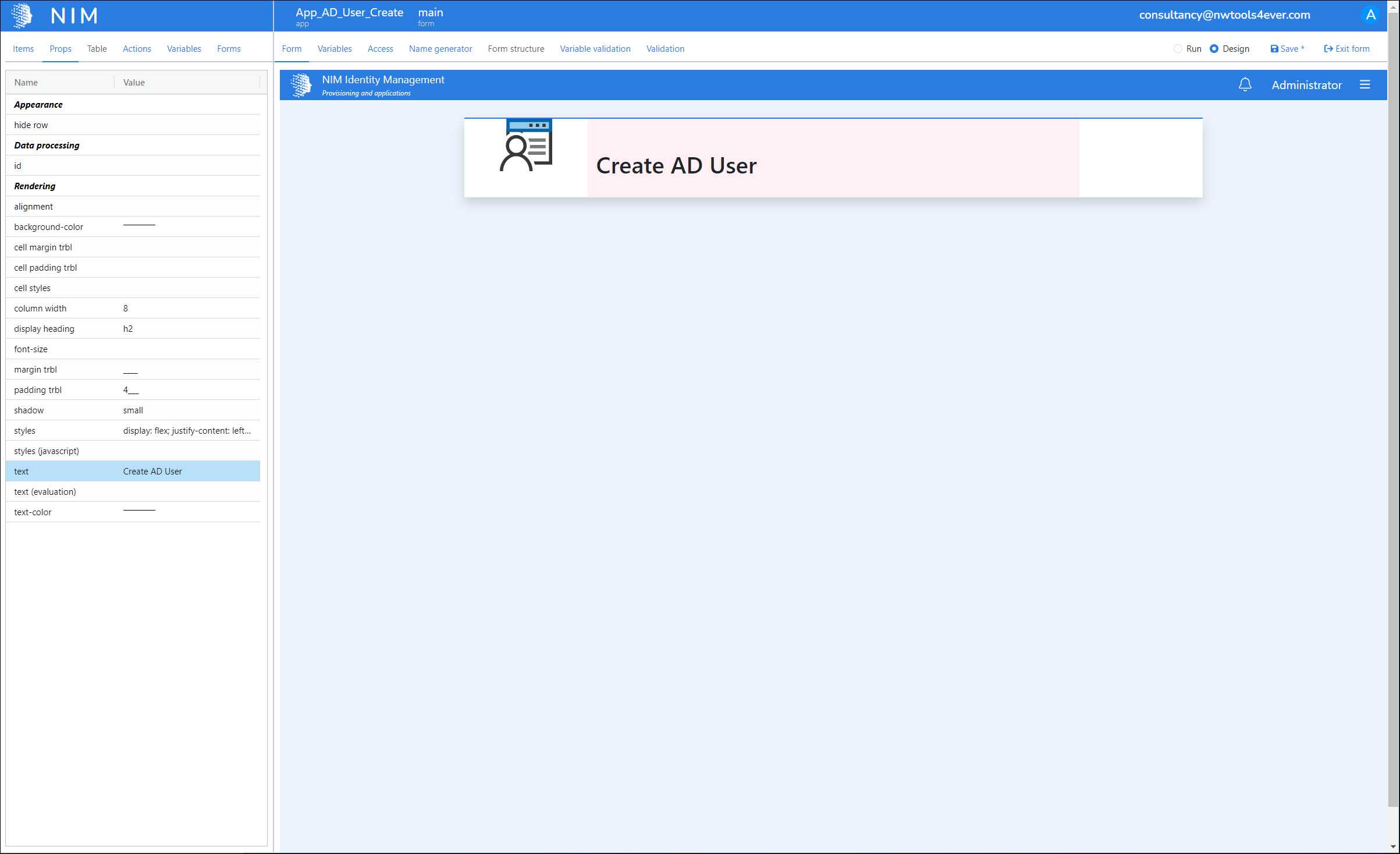
We'll set its properties as follows:

column width: 8
display heading: h2
margin trbl: ____
padding trbl: 4___
styles: display: flex; justify-content: left; align-items: center; height: 100px; width: 100%;
text: Create AD User
Tip
Since we set the static text item's column width to 8, and the image's to 2, this means we still have 2 more columns in this row to work with. We'll add another item there in the next step.
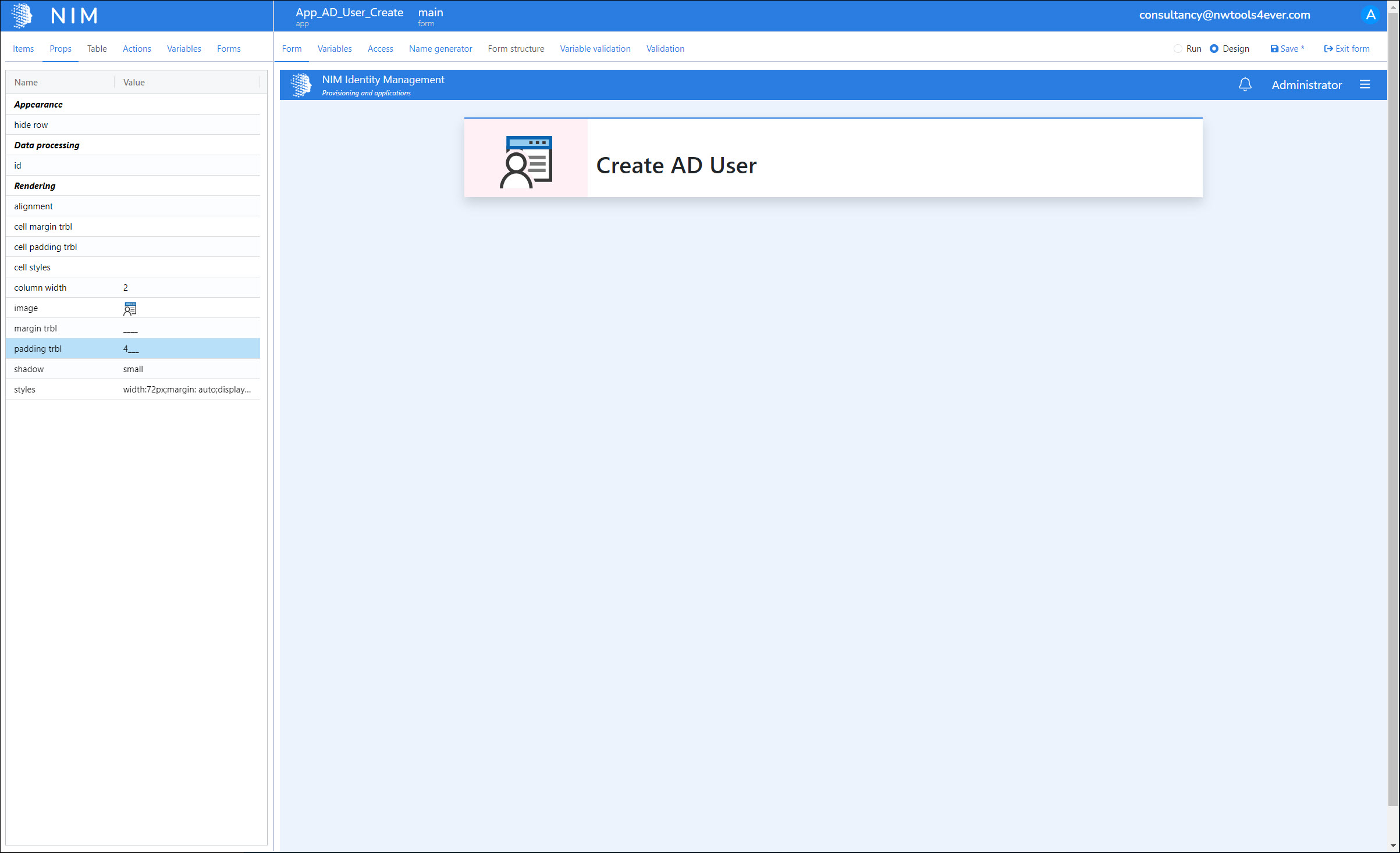
Because we added padding to our static text item, our image now looks out of place. We'll correct this by setting its margin and padding to the same values as the text item:

margin trbl: ____
padding trbl: 4___
We'll click Save to save our progress so far.